This is cool. Click here for a map of science as we know it. Reminds me of a number of topics we have discussed here, namely, digital methods, maps of submarine cables, and cartographic narratives from the past.
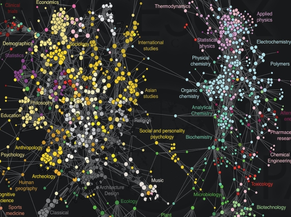
The above image is just a snippet of the original, which is only one of numerous maps to help make sense of massive amounts of data at Places & Spaces, Curated by the Cyberinfrastructure for Network Science Center.
Developed by psychologist Johan Bollen, computer scientist Herbert Van de Sompel, mathematician Aric Hagberg, physicists Luís M.A. Bettencourt and Lyudmila Balakireva, software engineer Ryan Chute, and graph-systems consultant Marko A. Rodriguez, this is the first map created from large-scale, world-wide scholarly usage data collected by the MESUR project from some of the world’s most significant publishers, aggregators, and large university consortia. It visualizes the collective flow of how information seekers move from one journal to another in their online navigation behavior. As it reflects the actions of those who read the literature but rarely publish themselves, practitioner-driven domains appear larger than in citation-based maps. Most scientific domains, including the social sciences and humanities, are highly interdisciplinary, but the latter are more so as shown by the concentration of connections in that part of the network. Practitioner-driven domains such as nursing and tourism are strongly manifested in this map because they are highly populated with non-publishing, non-citing scholars that nevertheless read the relevant literature in their domain.
Very cool stuff.

Pingback: Map of Science | deer hunting
this is Not a tree of life:
LikeLike
cool, looking forward to seeing it
LikeLike
Totally, totally. Frankly, most of my new work goes/moves in this direction — I am literally writing (at this very moment) about the conduct of scientific research in futures studies in order to examine — not join or participate in directly — how taken for granted aspects of their work produces all manner of secondary, collateral consequences for the field.
LikeLike
this is where STS/ANT could make a difference in terms of working on/with academic depts to see what/how they do and how it might be married to various tech innovations.
ANT fleshed out with a phenomenologically oriented enactivism/extended-minding could be formidable:
LikeLike
Holy cow — as I was reading your comment i thought “just like archive fever’ … AMAZING!
LikeLiked by 1 person
indeed, seems to be implying data not in the data set but somehow in the artificial map(ping), an arte-fact of the artefact. Reminds me of Derrida on archive fever. We need a new model of object-relations.
LikeLiked by 1 person
In fact the more I reflect on that statement “that the humanities hold together the sciences” I find it more and more opaque.
LikeLike
Yeah, the interpretation of these images — as nice as they are, as though observing from drone height — have a lot of work. We can render them, but interpretation is another thing.
LikeLike
ha more likely to feed into some bean-counting system to fuel competition, create artificial scarcity, etc. I think there is something to these visualizations that make it all too easy for folks to fall into mistaking the map for a structure/terrain or saying things like the humanities are holding the sciences together, sort of a higher-tech version of Wittgenstein’s bewitchment by grammar and the like, needs some study for sure, beta testing anyone?
if ever there was tool for priming reification errors and the like these sorts of products seem to be them.
LikeLike
That is step two, no doubt. Graduate students, unite!
On Tue, Mar 7, 2017 at 6:43 PM Installing (Social) Order wrote:
>
LikeLike
sure, was presented here as the “structure” of Science, are all of these disciplines/departments even science departments (or “highly interdisciplinary”, is just looking into other disciplines research reports what it takes to be interdisciplinary) let alone facets/components of some greater body/system?
LikeLike
Thanks, dmf, for bringing this to my attention (I read their book when I was sitting on the Robert Merton Book Award committee, and just never put two and two together).
LikeLike